Designed for Sur La Table stores under the art direction of Alexa McNae, this comprehensive signage system includes considerations for evergreen fixtures, sales, and seasonal displays.
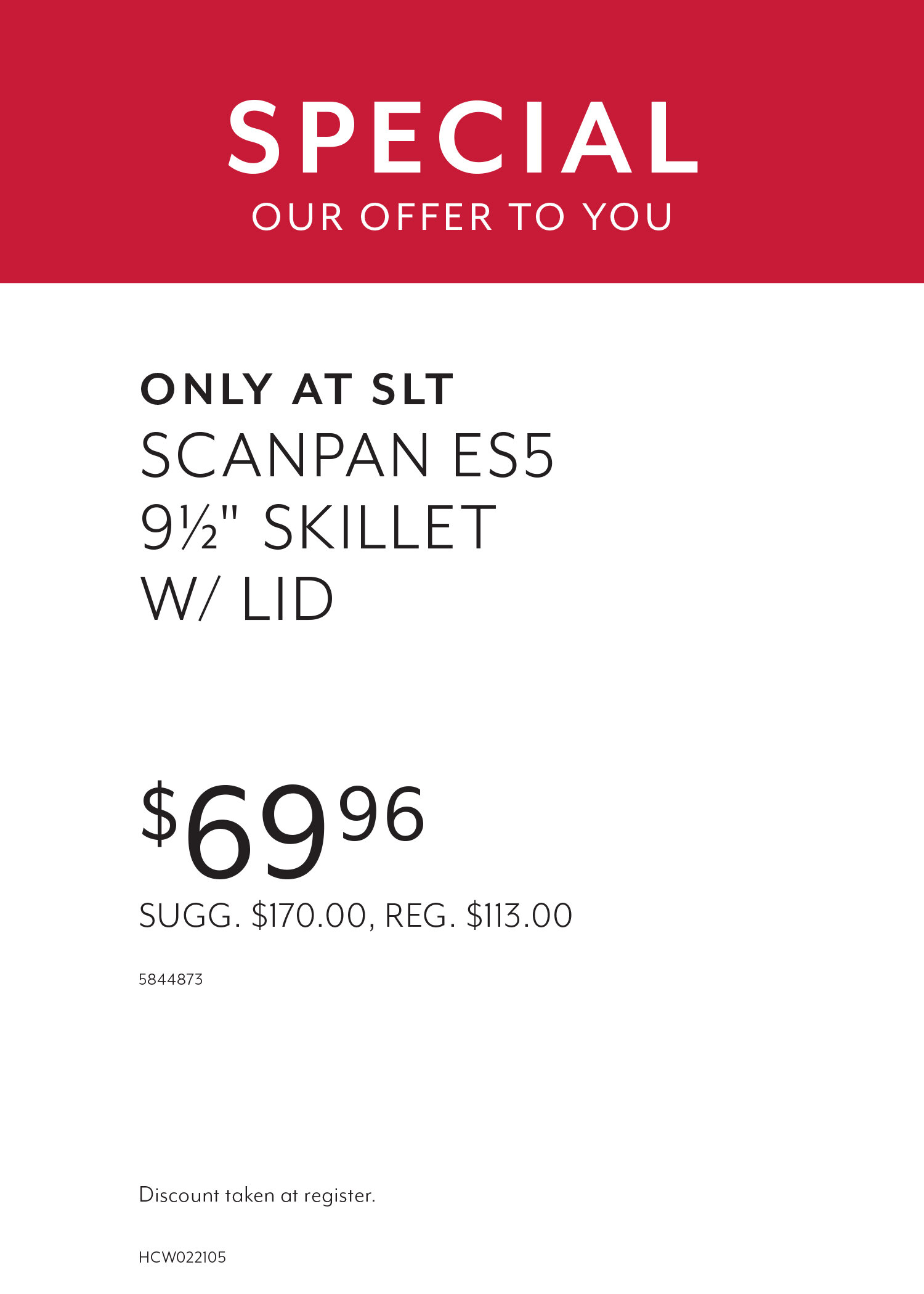
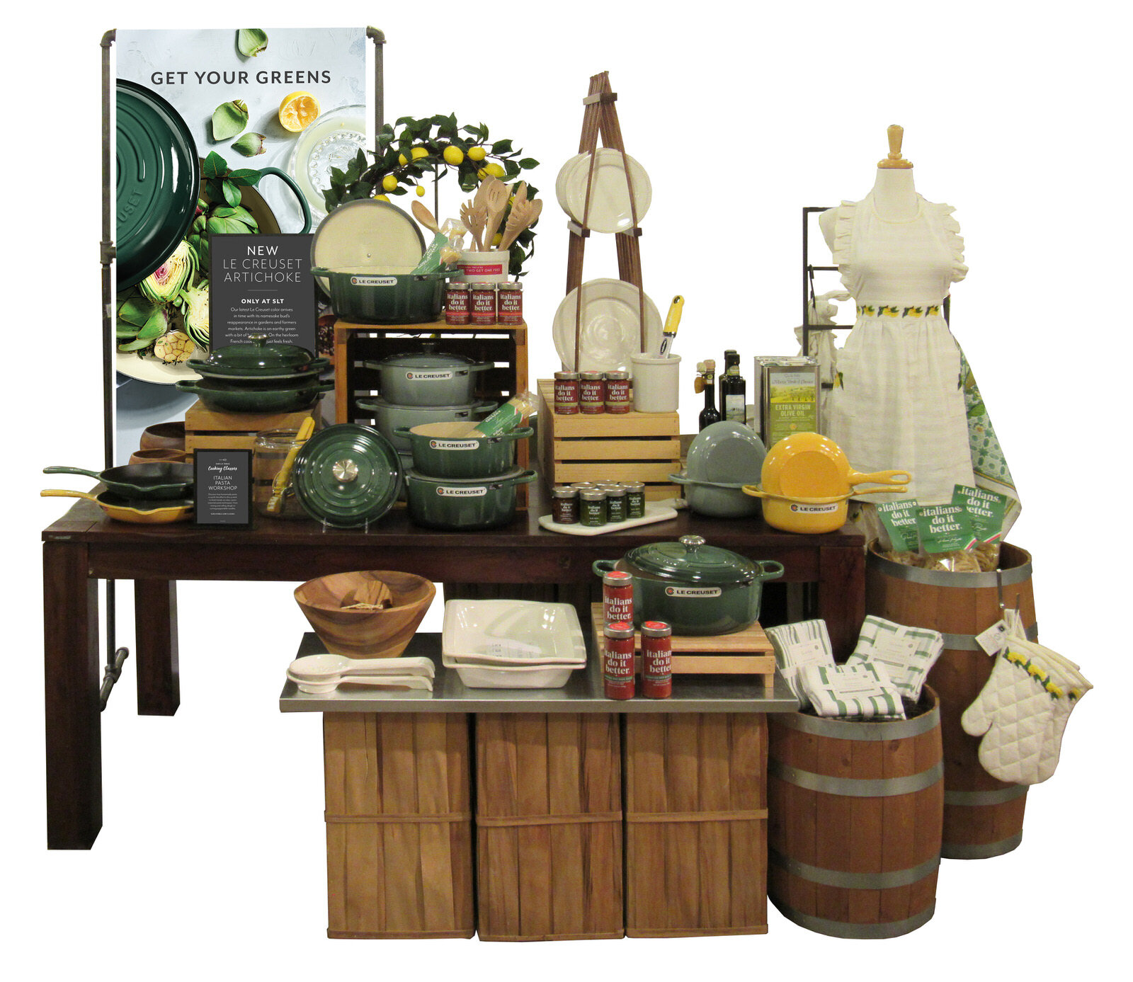
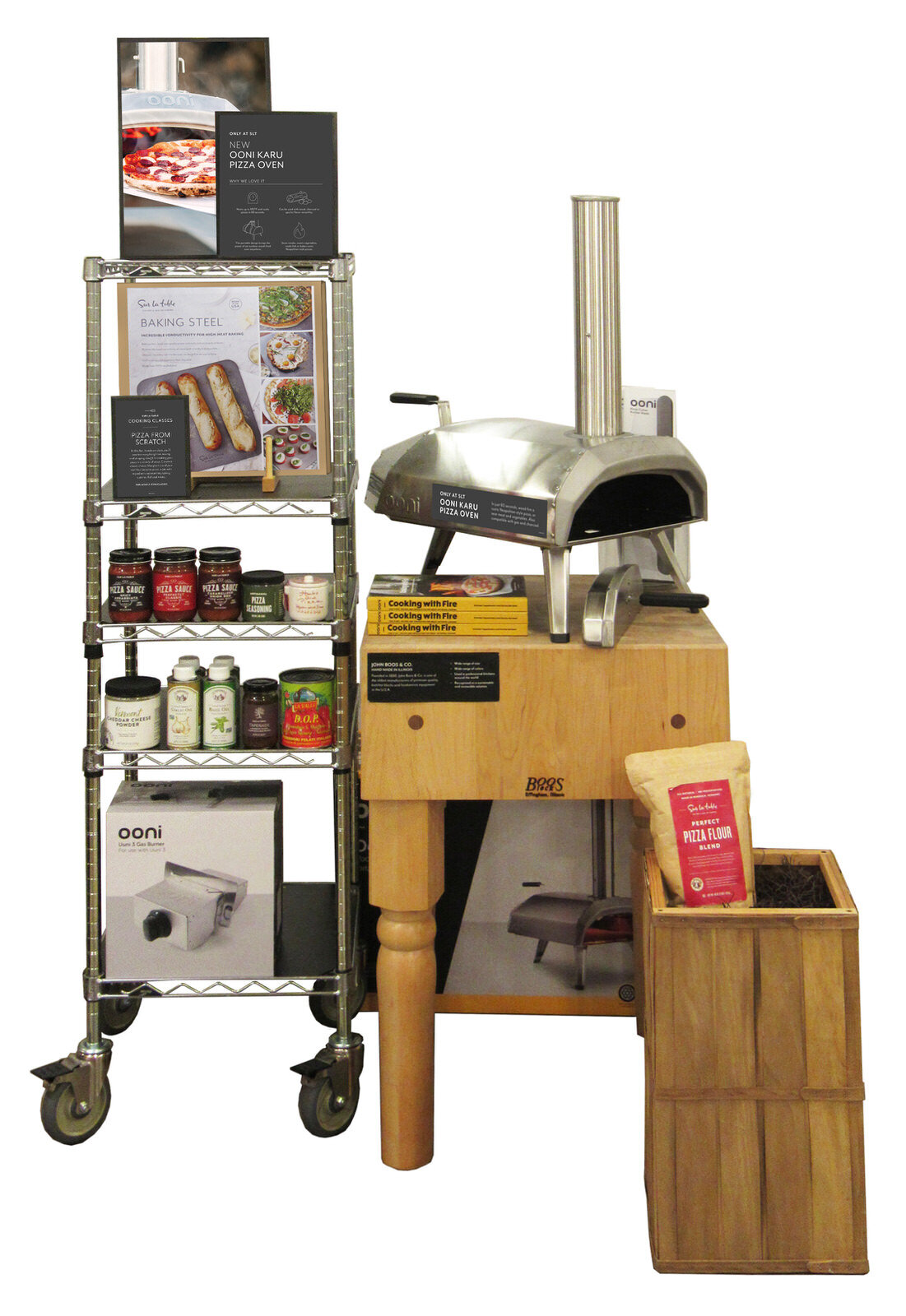
Layered images and informational signs show off the inspirational food photography central to the Sur La Table brand, while allowing customers to get into the nitty-gritty features and benefits of individual products. Smaller white signs with red toppers clearly communicate sale pricing to customers, while allowing for store flexibility in the case of last minute promotions or price changes. Stores can print PDF signage on their inkjet printers, add an existing red sale topper, and slip it into the frame, producing a visual that is consistent with signage printed months in advance.
Creating consistency and structure in the way we design signage allows for more efficient art and production processes, and provides the customer with understandable, consistent ways to navigate our store. Sale pricing is always red and white, and long-lasting informational signage is always pepper, one of our brand colors.
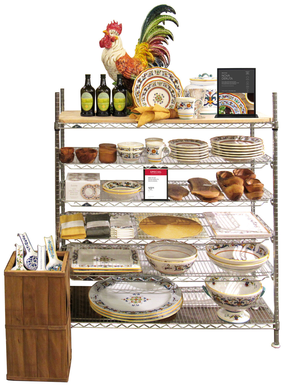
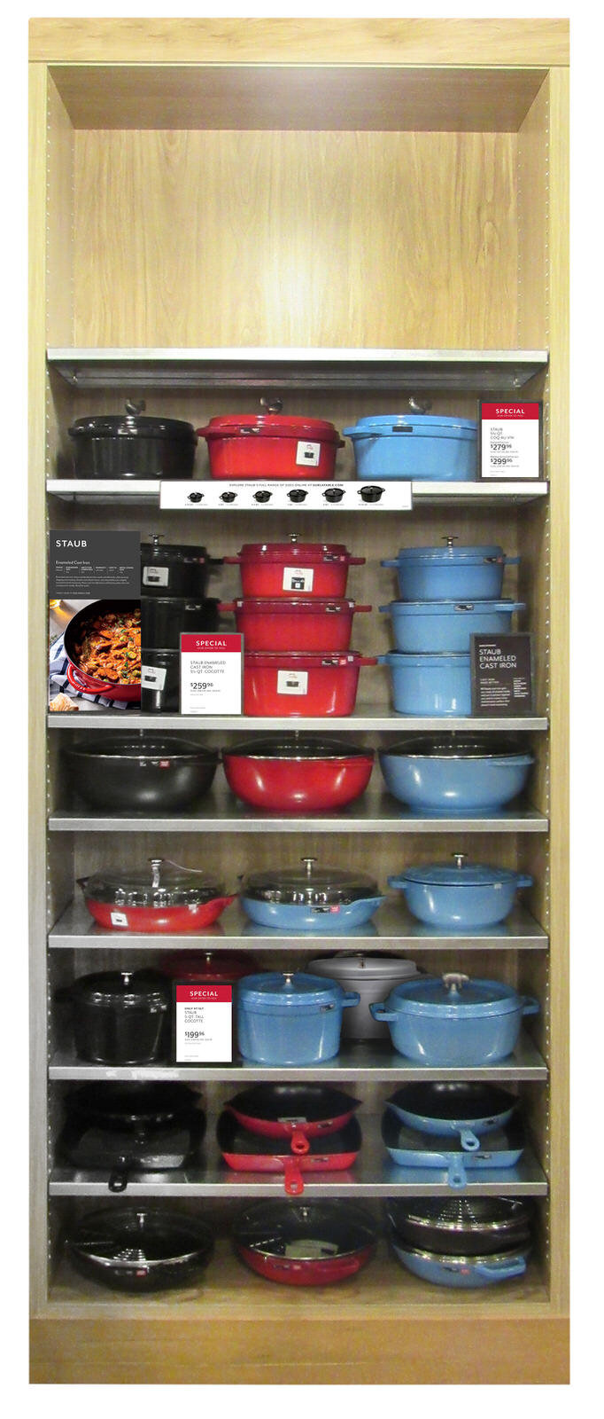
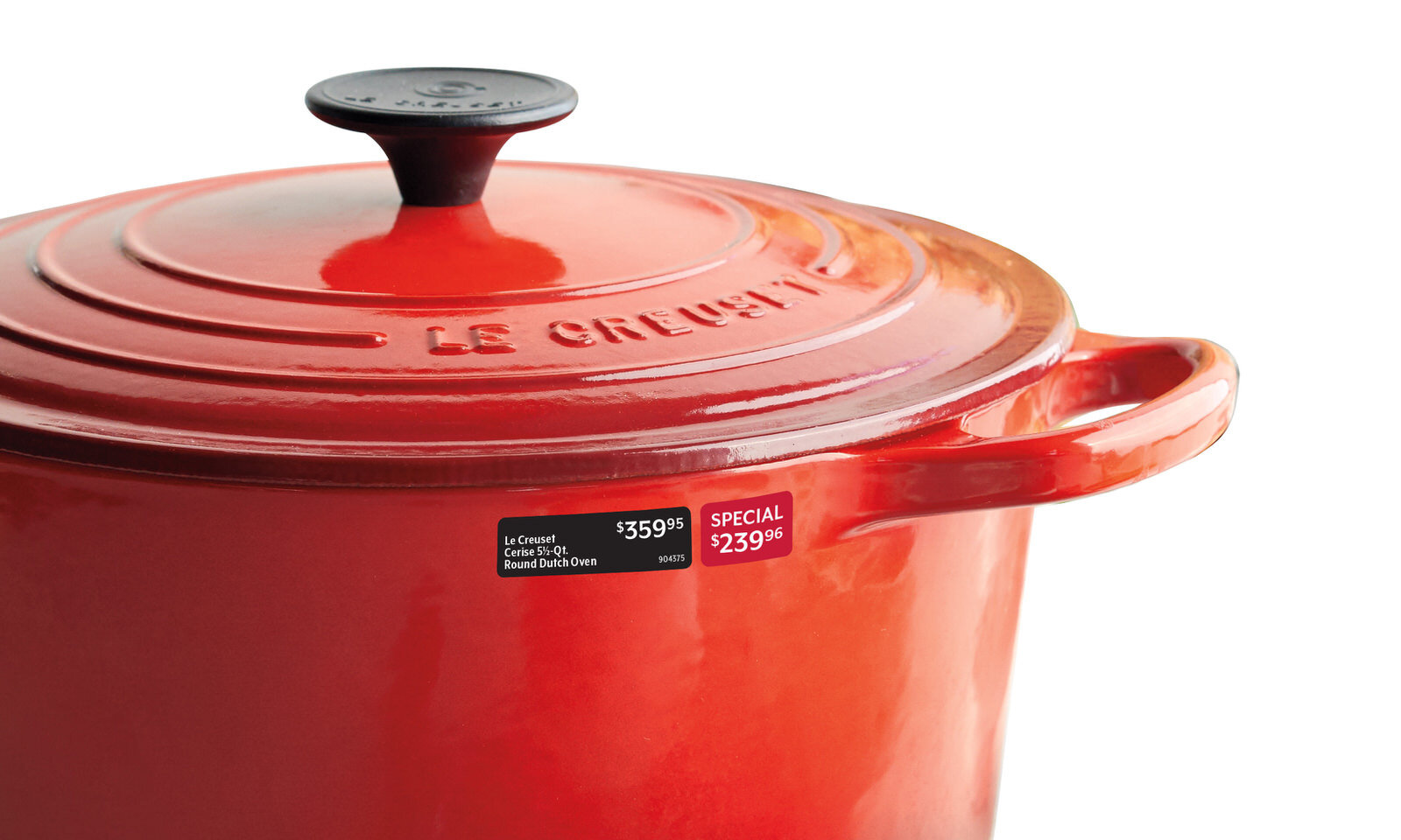
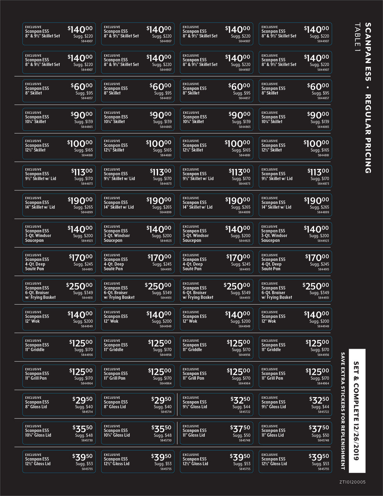
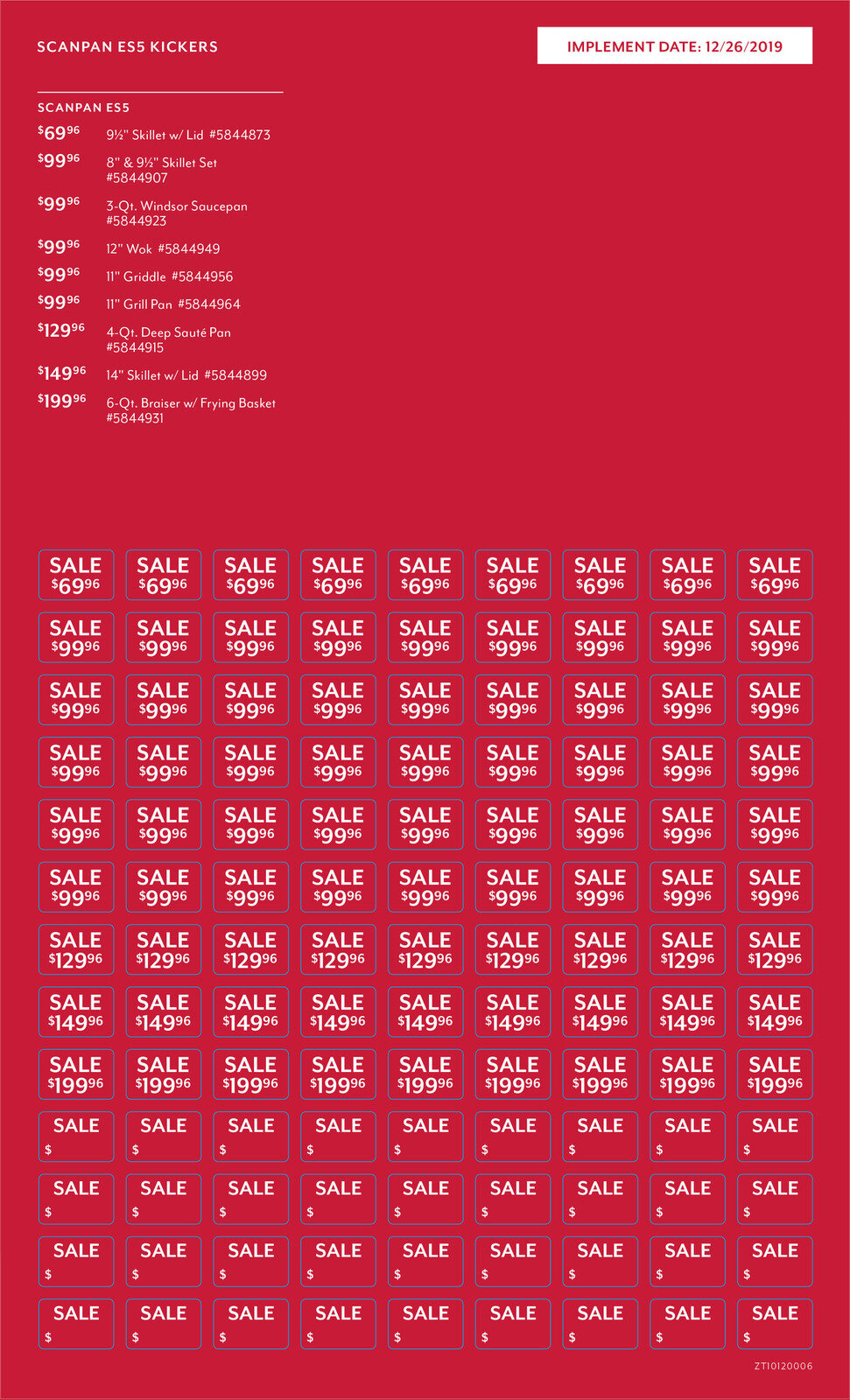
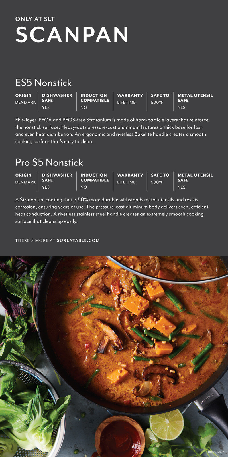
In the cookware department, I developed a sticker system that helps customers quickly identify the pricing of each piece without having to pick up heavy pots and pans. When products go on sale, stores are provided with a red sticker sheet with the sale pricing that they can add onto the items that require it. Once the sale is over, these stickers are easily removed without damaging or removing the regular pricing information, reducing the number of steps a store associate has to take post-sale. In addition to pricing stickers, there are informational signs throughout highlighting the brands sold and the features and benefits of each. Like in the front of the store, sales are marked by red and white signage that can easily be updated on the fly by stores as needed.